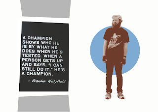
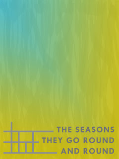
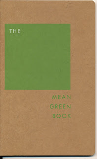
For the past two days, I've been going through Photoshop tutorials and trying to pick up some necessary basics. I have only used it before for lightly editing photos, even though I generally abstain from digitally altering film photos. (It just seems so unnatural and wrong.) It was high time for me to dig into this tool, as I drool over good design without giving it much thought about how it was even made. Sometimes I have an idea, but then I feel completely stumped when I do not have the learned skills to recreate it outside of my mind's eye. But we all know that is an excuse to be lazy, so here's to not being lazy. Hopefully I can pick up a few golden tips from Kronicred in a few weeks. And if the interest remains, I'm eyeballing the ACC Visual Communication program- 'cause at $42/ hour, it's a steal!
I am so inspired by ISO50's posts on classic, minimalist design and his own work. I really want to know how he achieves the vintage/grainy color and texture effects. Right now, I'm keeping it simple. You can do a lot with text and basic shapes. You can also make something very uninspiring and boring. I'm very afraid of the latter. I want to eventually feel good about what I create, knowing that it has that special artistic pop to it, where when you glance at something, you know that everything is in its right place (!!), and it couldn't be improved on. Dunno how to do that practically beyond using a grid and color theory, but I guess that is what design books are for. Sure hope that skill can be learned. And then there is complex, beautiful stuff that I would never dream of being able to create, because I am too impatient, and that is OK.
Note: I am quickly learning that copy is just as important as the graphics. Random phrases really won't cut it? Aw, man.


1 comment:
I've met that guy in the iso50 poster!
Post a Comment